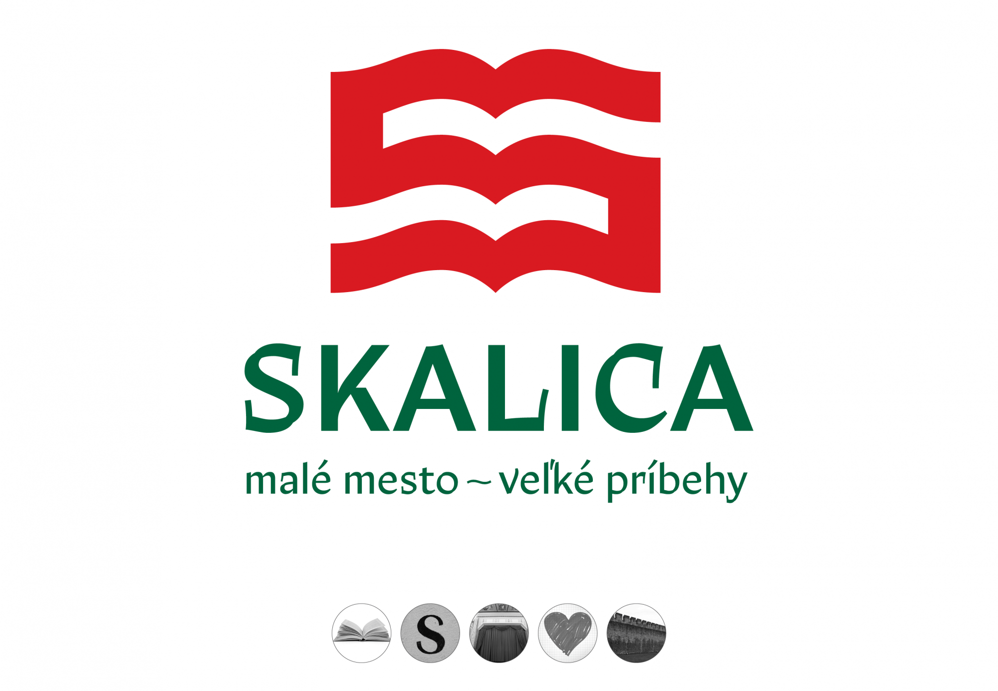
The design is based on the idea that if all the events associated with Skalica – from its elevation to a royal city, through frequent fires and the great development of crafts, to the liberation struggle against Hungarianization – could be summarized in a single word, it would be the word “story”. Every corner of the city can tell its own great story. In order to preserve them, it is necessary to write them down – this is where the visual identity comes from.
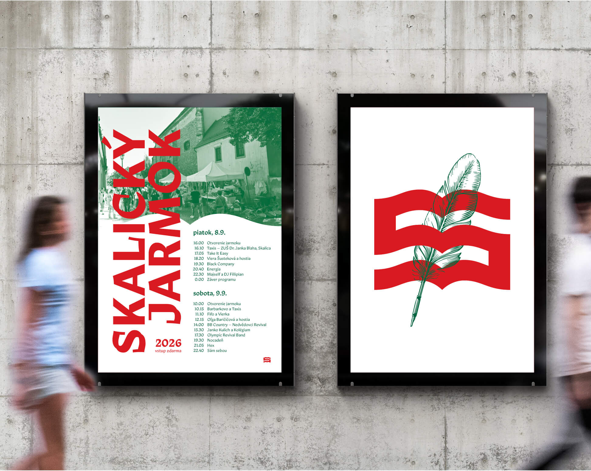
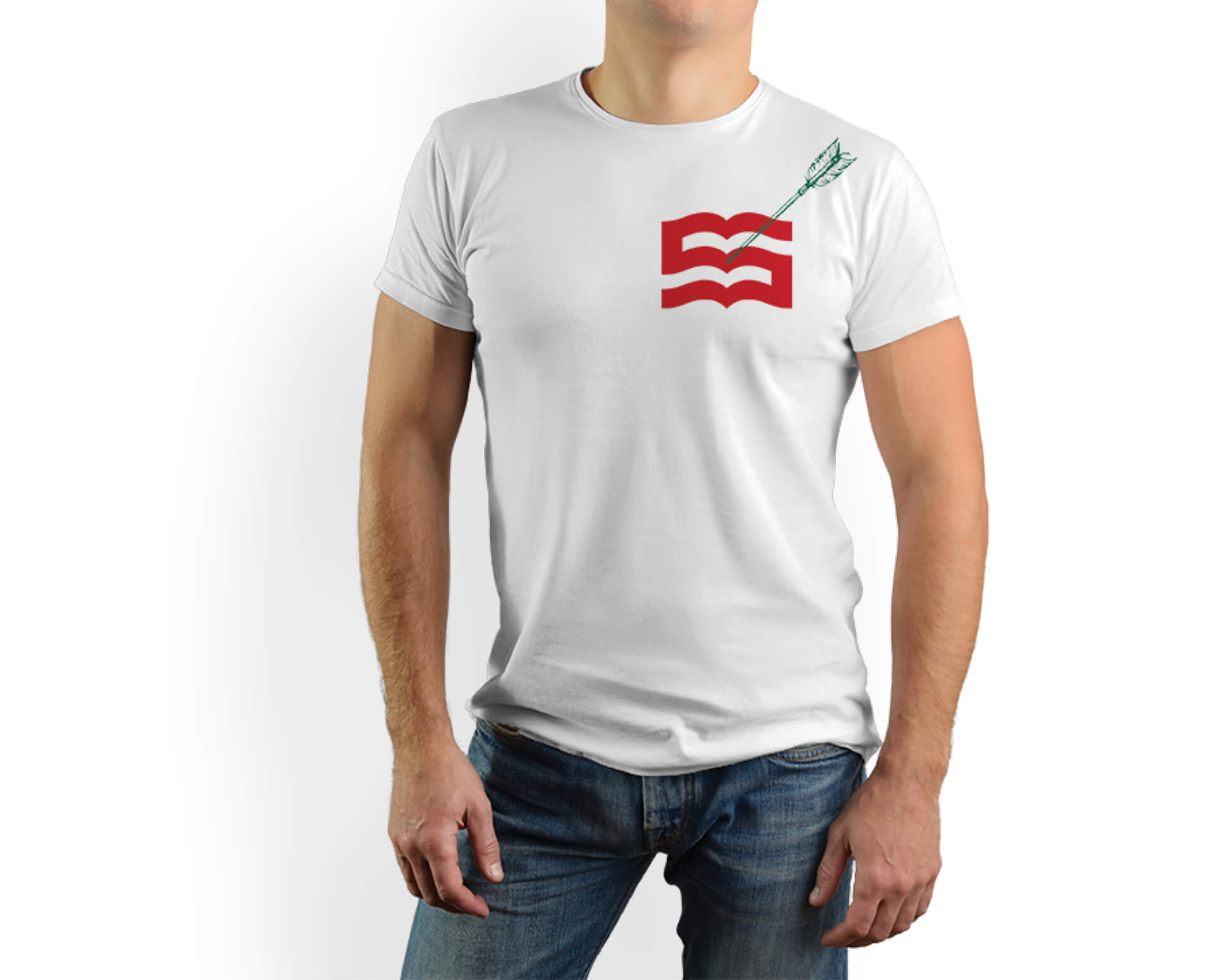
The logo is intended to express the importance of the city as a cultural center of Záhorie. It combines several symbols – we find a book as a general symbol of a story, the initial letter of the city, impenetrable walls as a symbol of a fixed place in history, a theater curtain, but also a heart as a metaphor for local patriotism. Through its processing, the logo refers to craftsmanship as a typical value of the city.
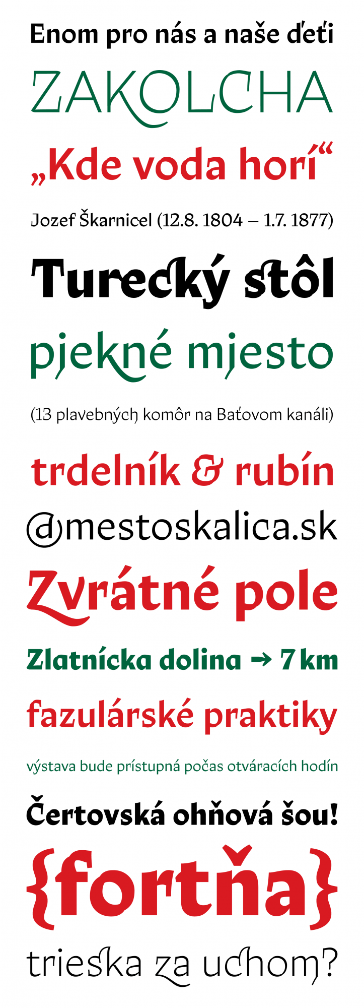
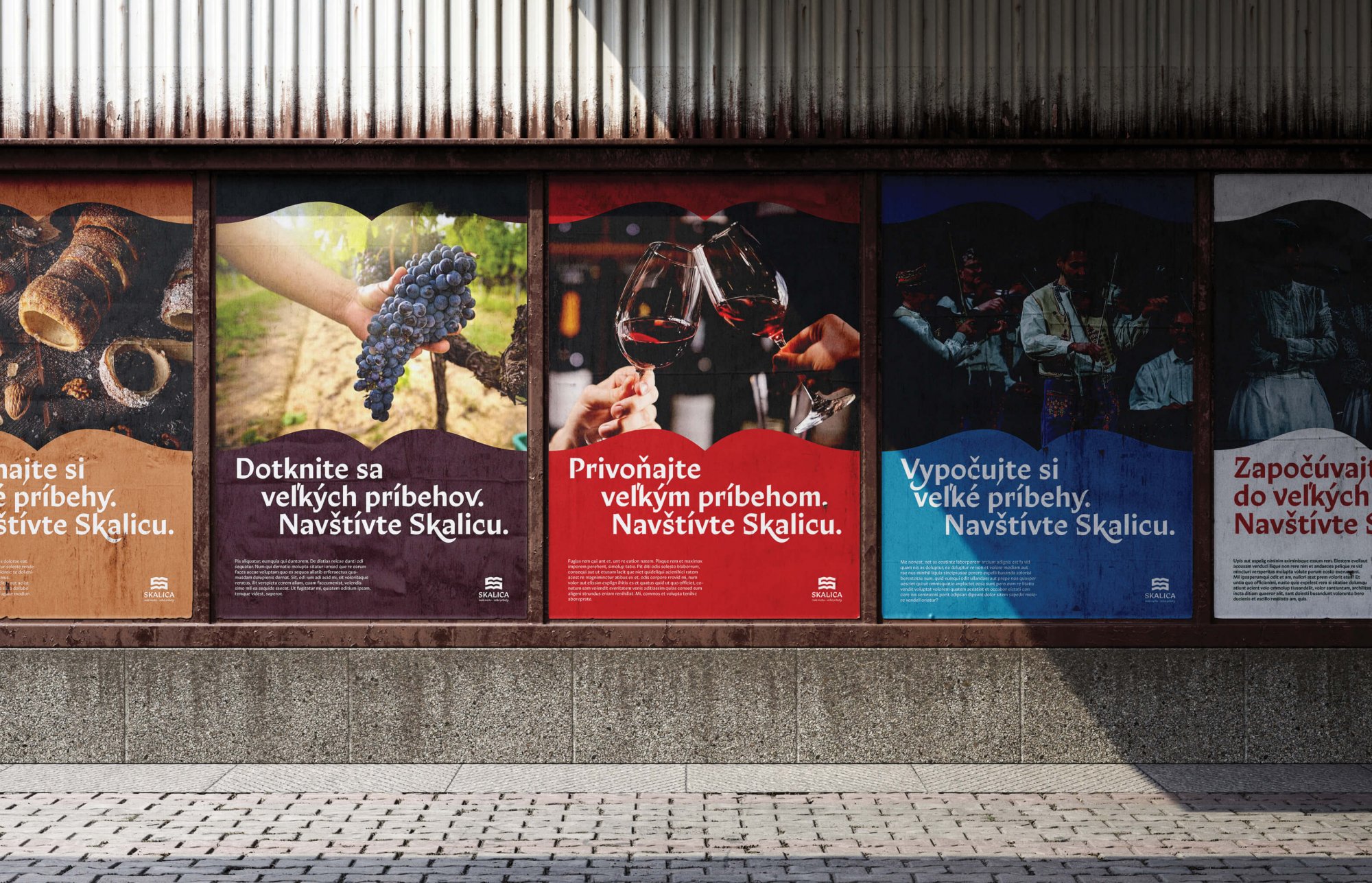
The slogan use mathematical symbol to compare the physical size of the city with its cultural size. It speaks not only of the rich history recorded in legends, but also of the city's importance for the Slovak language and culture in general. And great stories deserve a grand voice, so a custom-made font is part of the design.
The font is both a tribute to the oldest printing house in Slovakia, located in Skalica, and an attempt to capture the colorful urban language in visual form. The long vertical serifs, following the curvature of the pictogram, and calligraphic details in arches, acknowledging its artisanal origin, are characteristic. The advantage of a solution using a font is 100% consistency, because any typed text automatically expresses its affiliation with its visual style.
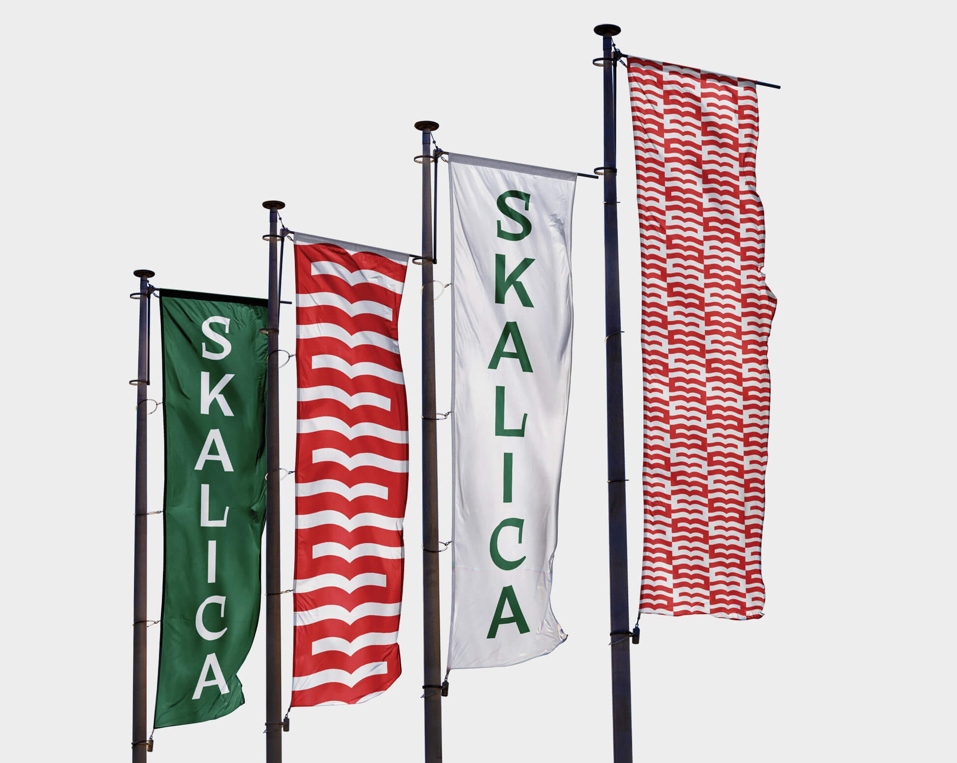
An additional graphic element is the wavy line taken from the logo in all creative forms – it can be cut into a photograph, used for a decorative frame of the format, or as a wallpaper pattern, etc.


The font is designed to support the historical atmosphere, but still retains its sobriety. The calligraphic solution of the arches follows the symbol from the logo. The font has a humanistic basis, but there are clear details known from Gothic calligraphy - broken arc shapes and thin lines drawn with the edge of a flat pen. It will therefore be interesting enough in large headings, as well as inconspicuous enough in small and long texts.
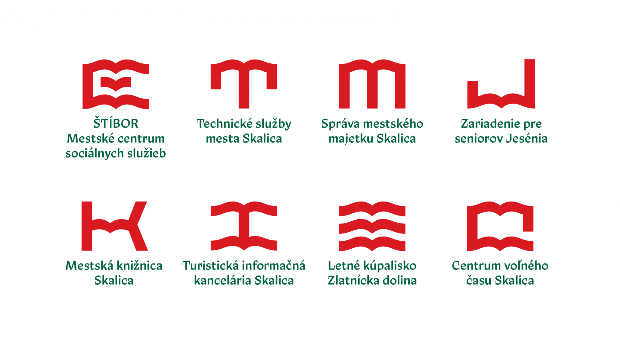
The sub-brands of city organizations are derived from logo symbol in a simple way – the basic template remains, only the interior is rearranged so that it best refers to a specific organization.