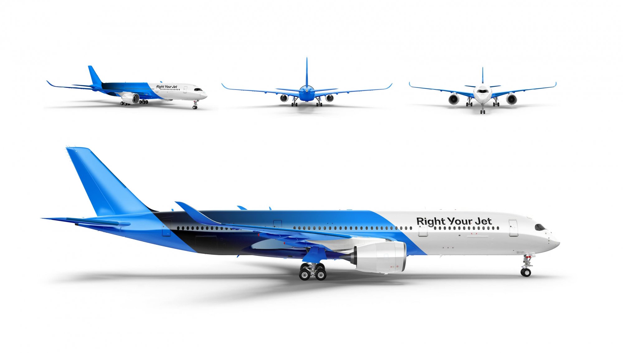
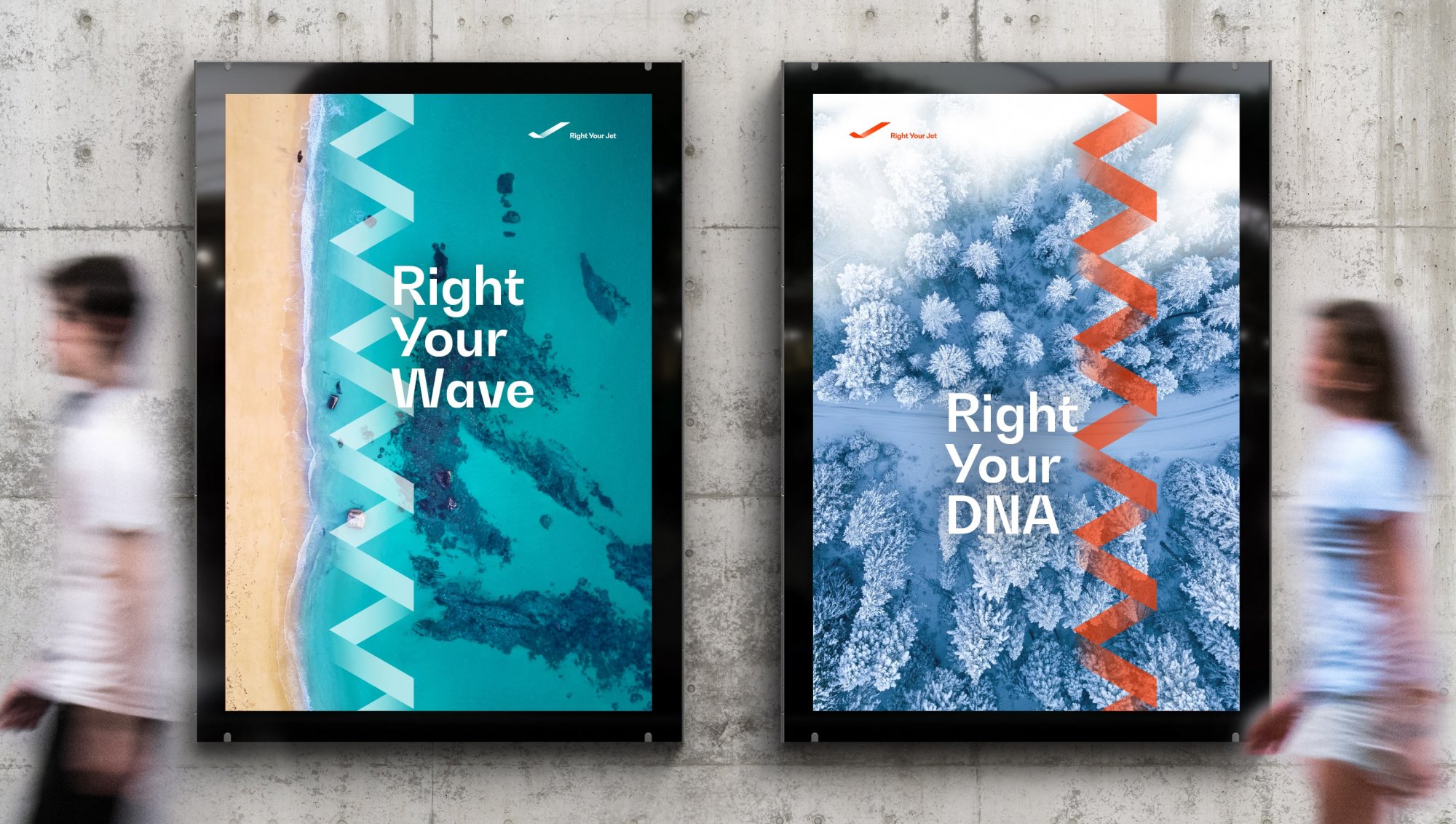
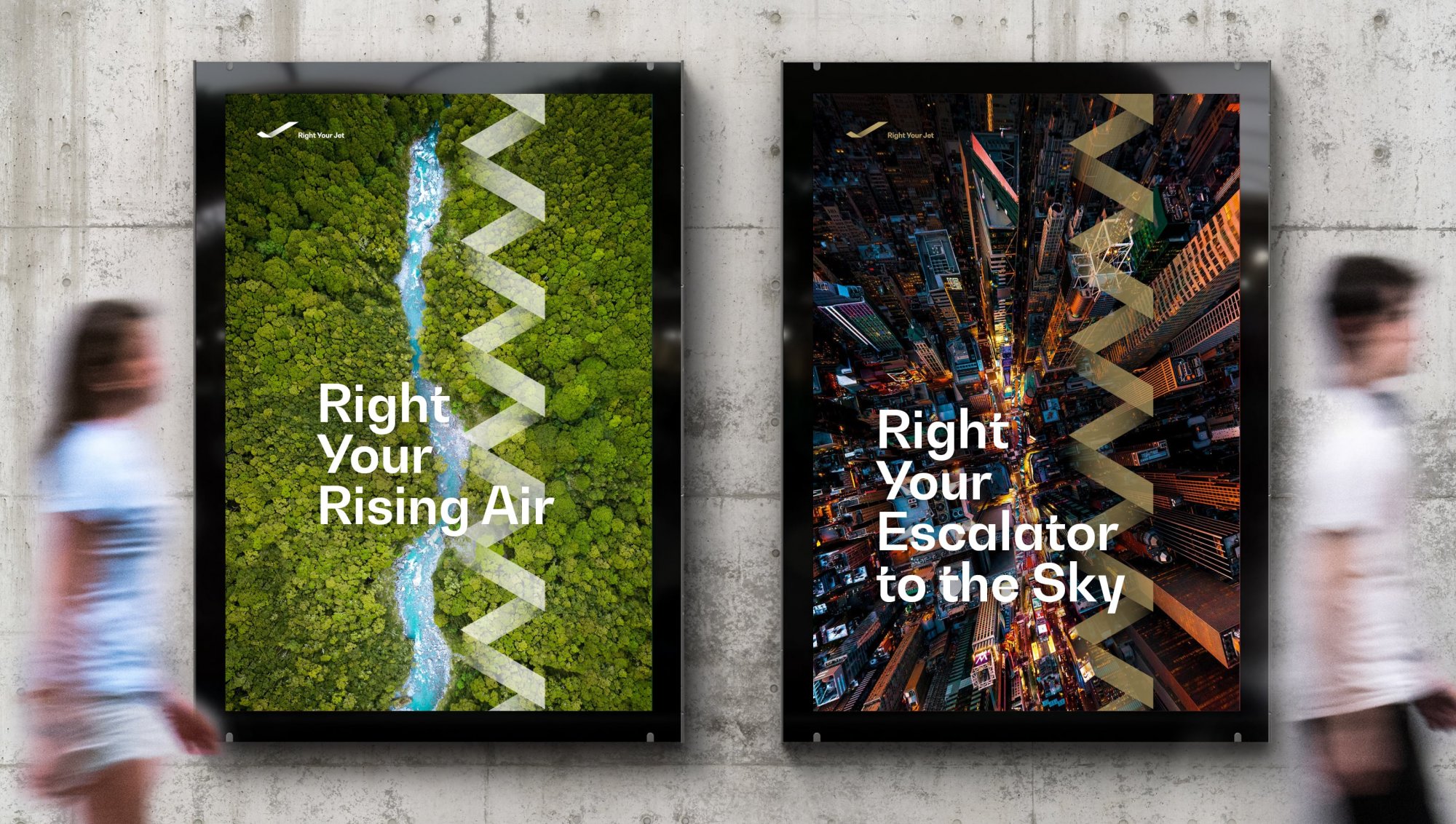
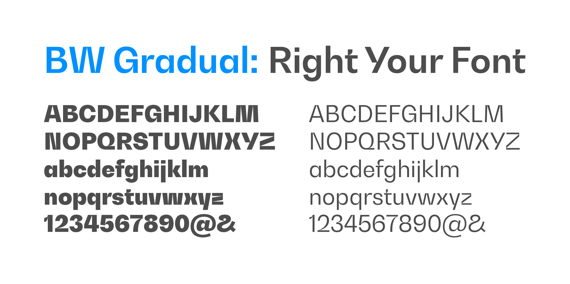
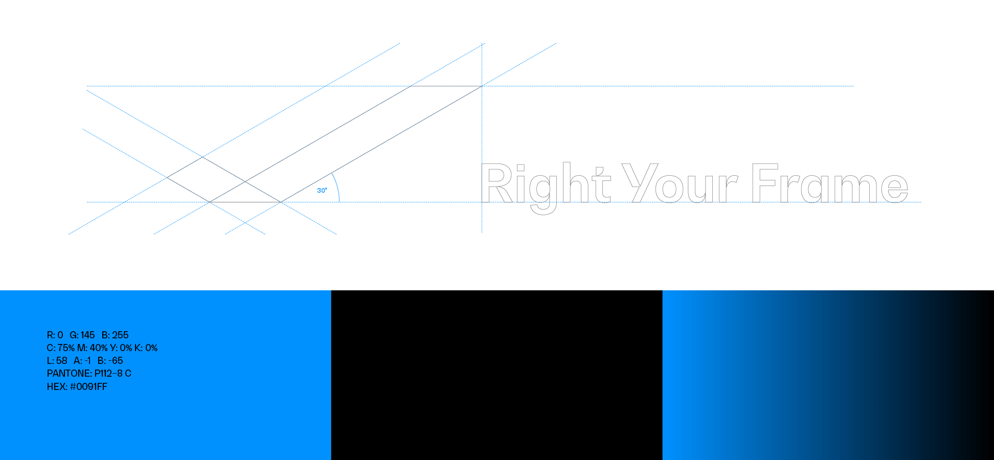
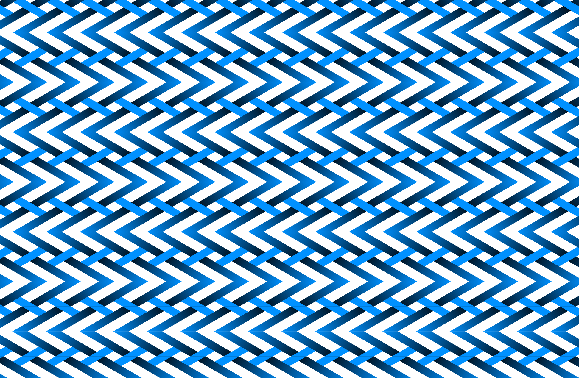
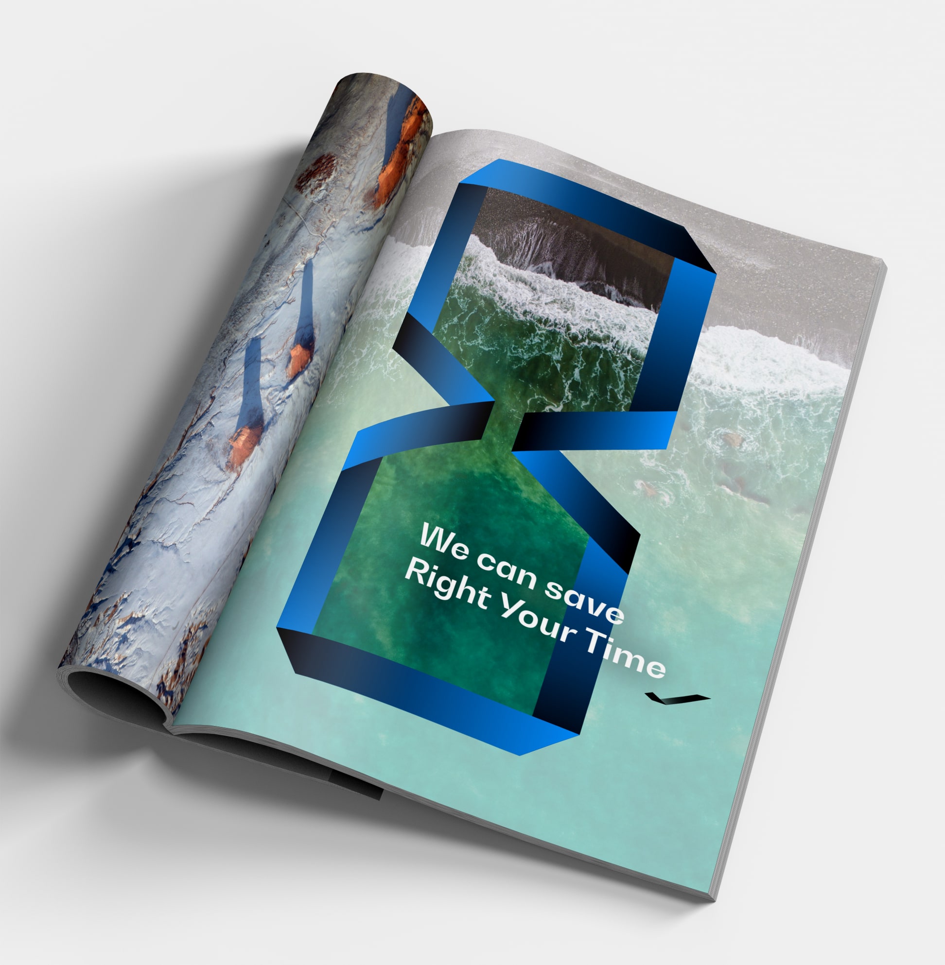
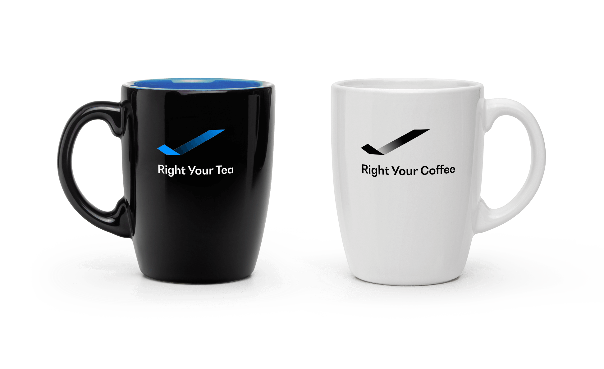
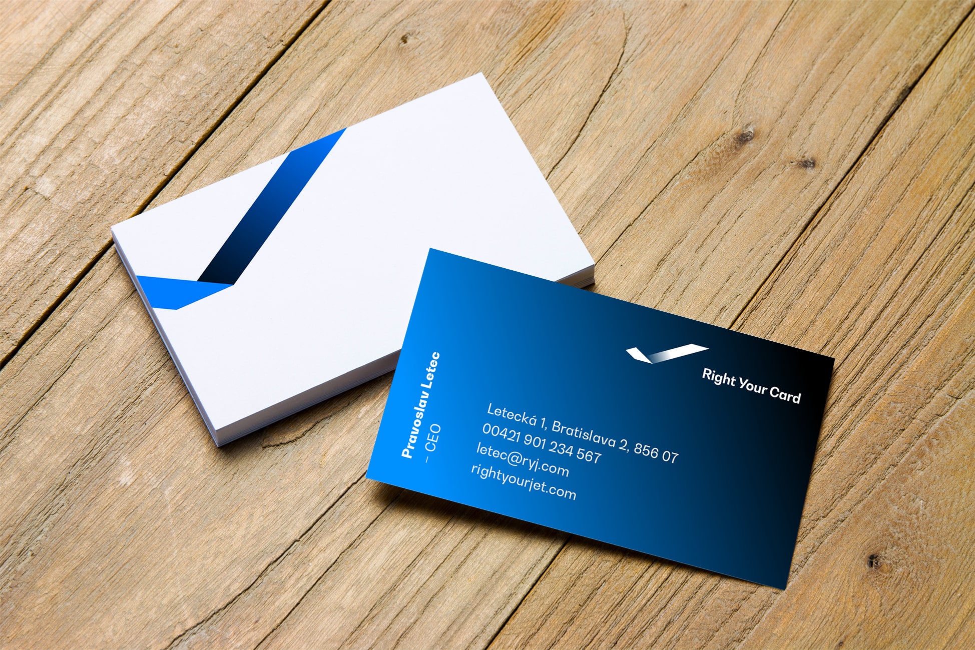
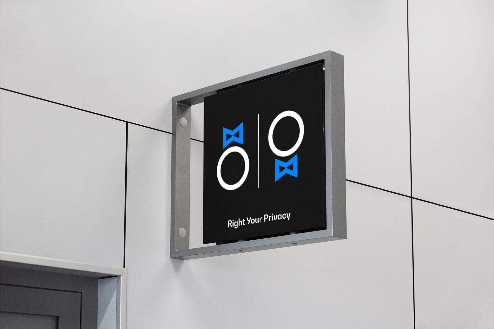
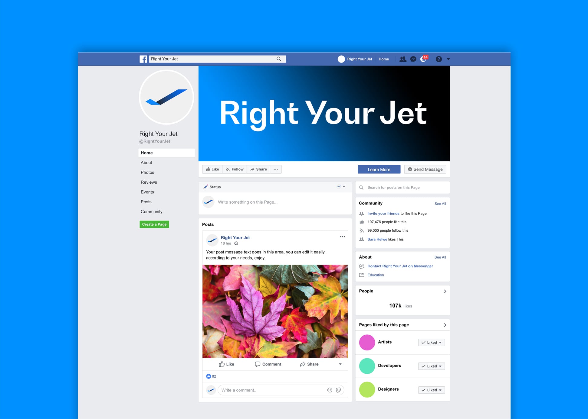
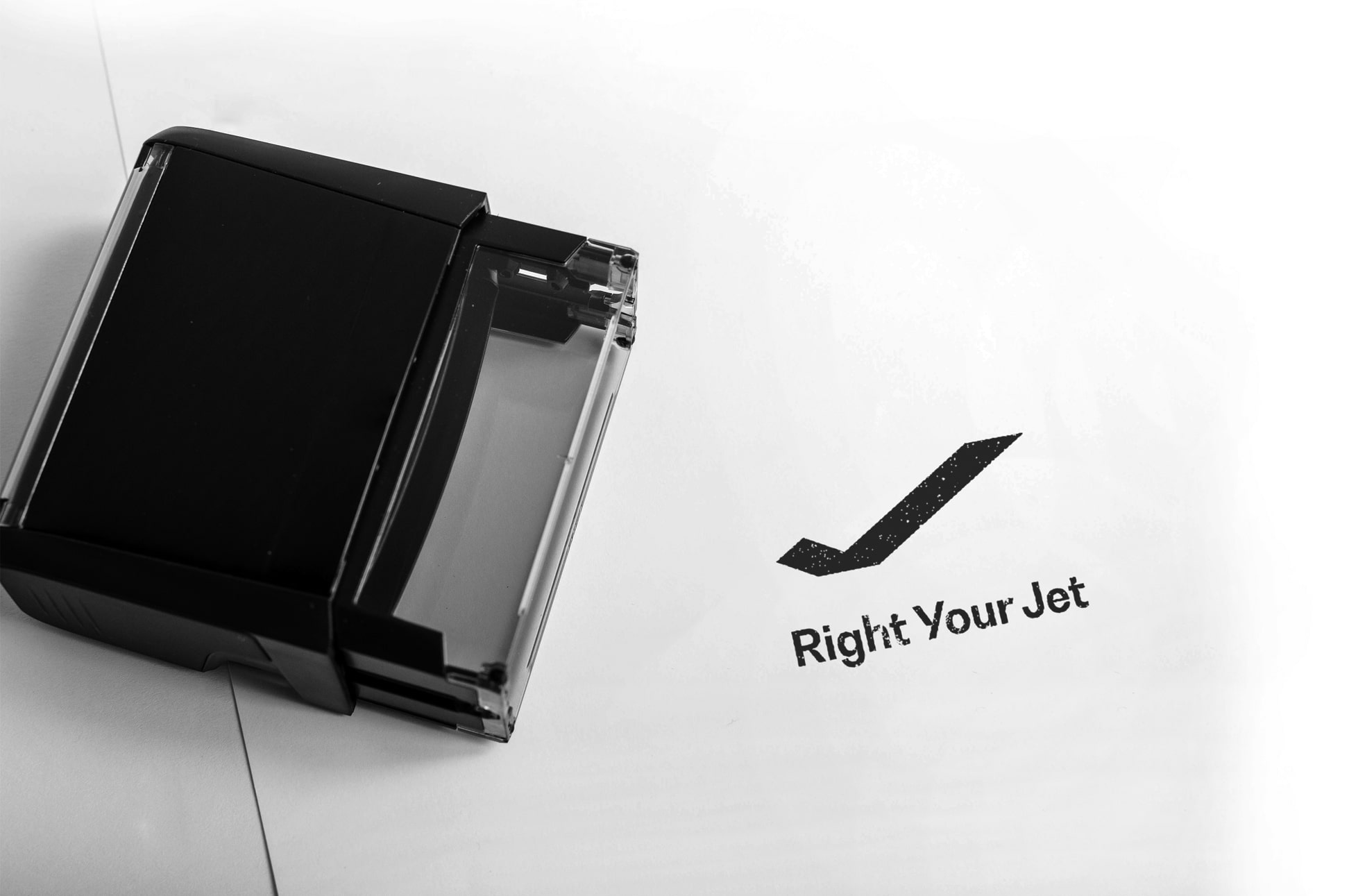
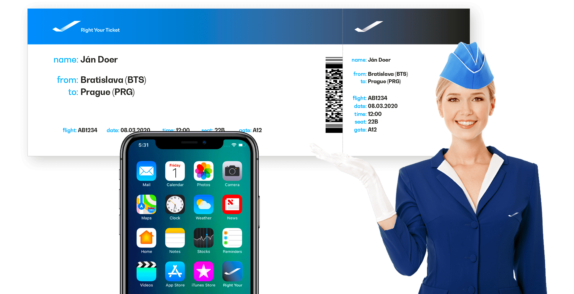
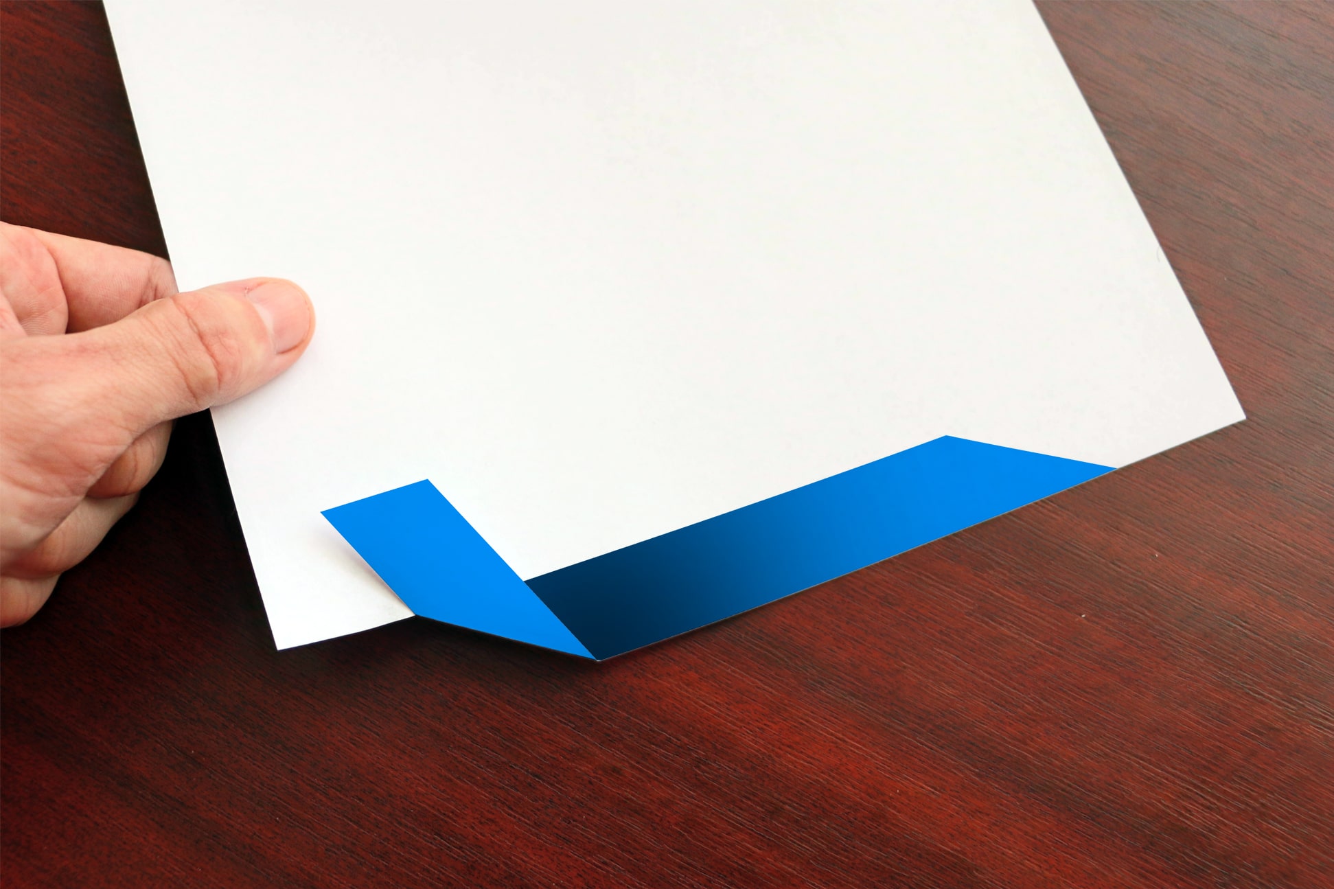
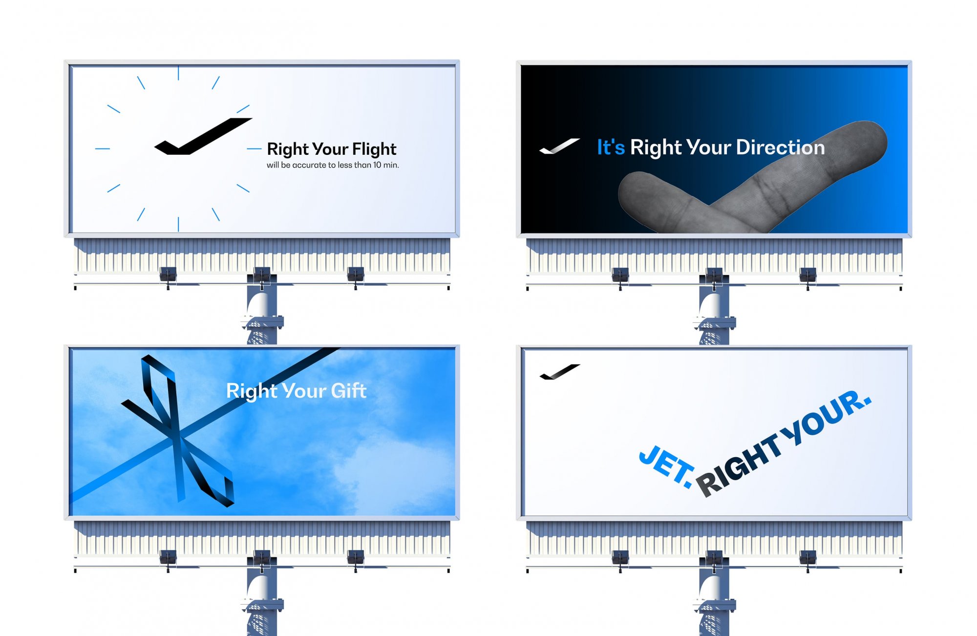
The name evokes self-confidence and success – that is, the qualities that a potential customer should have. “Right Your” also means exclusivity, something that not everyone has. The logo consists of a stylized emblem of the aircraft with universal symbol of accuracy. In the next layer, it is a ribbon as a symbol of something precious, and the letter “J” from the name. The farthest association is the clock, as a symbol of the exact timing which is important for this company. An additional graphic element or wallpaper pattern is derived from the logo. Clear and clean logo shapes communicate reliability and certainty. In special cases such as a stamp or the physical engraving of a logo, its components can be merged into a solid form. The selected font (BW Gradual) has a certain “aerial” atmosphere in its shapes. The combination of bright blue and black and their gradient creates a noble and luxurious impression – as the company’s services should look like. Since the name itself is a playful claim, it is possible to modify it according to the context e.g. to “Right Your Air”, “Right Your Time”, “Right Your Color”, etc. and so create a coherent and memorable brand communication.
![]()
![]()