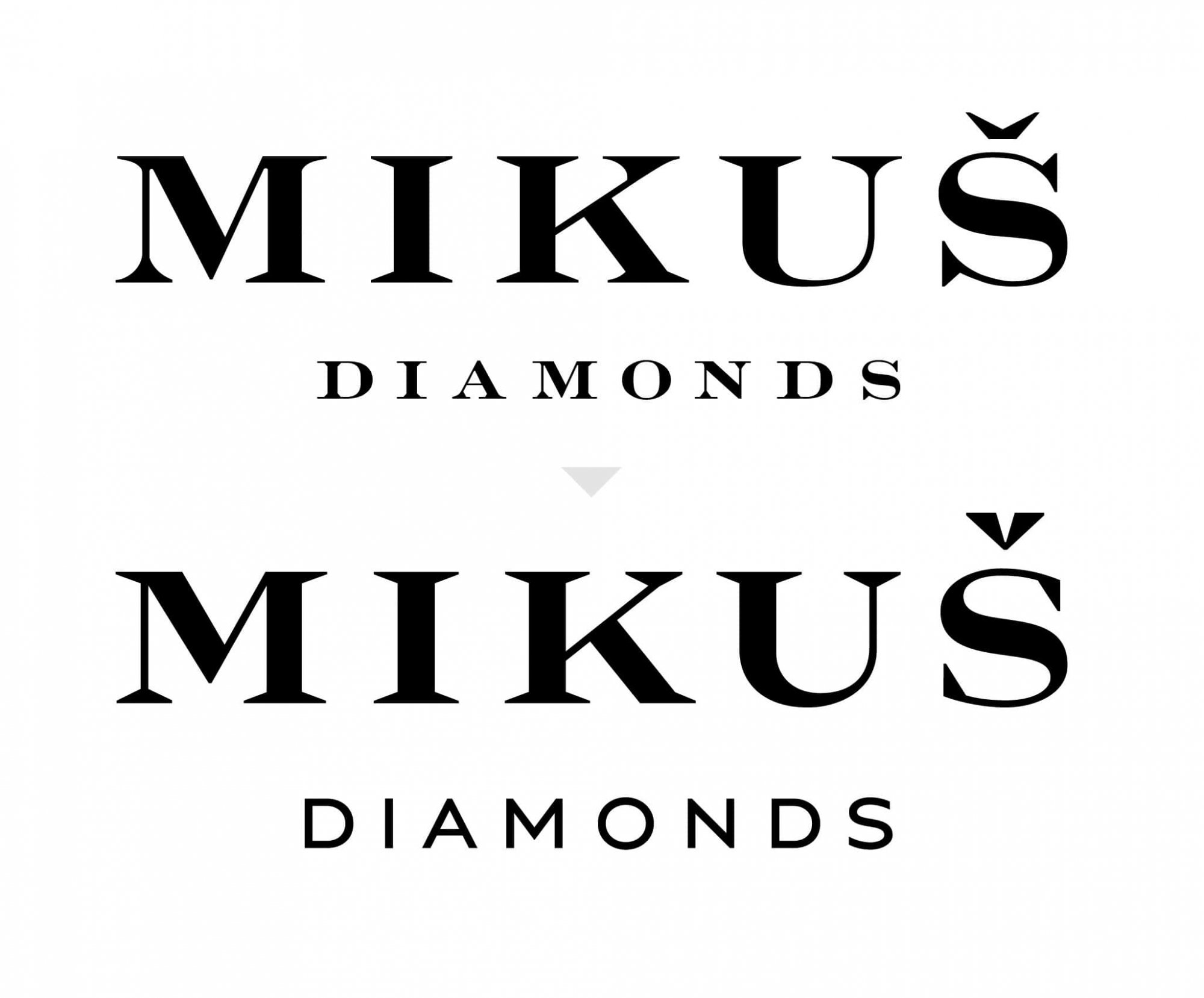
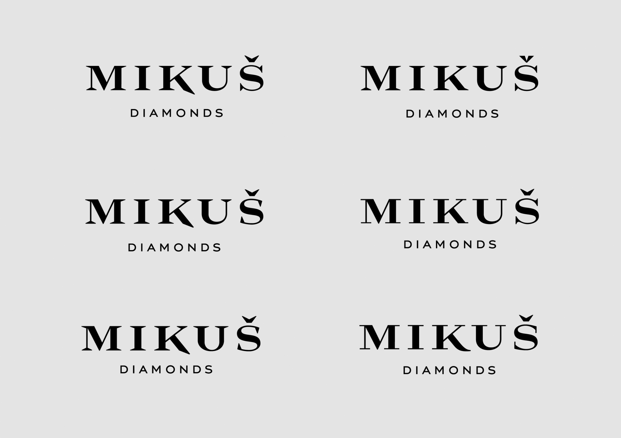
Logo redesign. Cooperation with Miro Sedláček (Dizajnlab s.r.o.) The task of redesign was to harmonize this custom letters and so express the seriousness and precision of a jeweler company. The characters have been cleaned, kerning and optical balance improved to make the name well working at small sizes. Diacritical sign got a tiny exception for better logo memorability – inverted contrast, reminiscent of diamond shape.