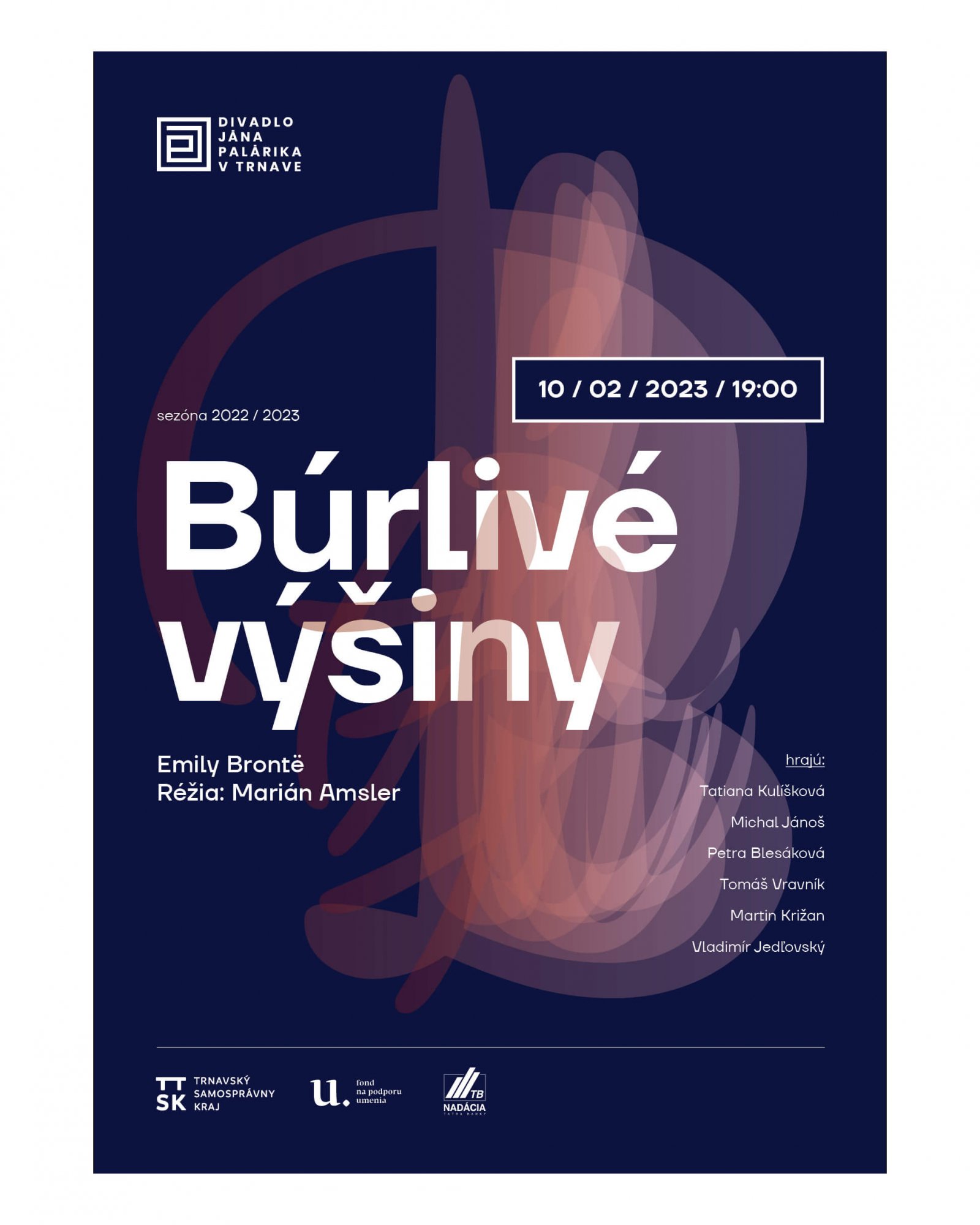
The concept is based on the visual contrast of two fonts. The austere and cold grotesque TT Firs Neue with its angular shapes creates a strong connection to the DJP logo, which contributes to immediate identification.
Liza Pro's lively and detached brush font represents the element of illustration here. The title of the performance is made up of individual letters that are stacked on top of each other. Together, they create the impression that they are performing some action (kind of like a long exposure photo). This great font includes 4 – 5 shape variants for each character, which is a guarantee that the illustrations on the posters will never look identical.
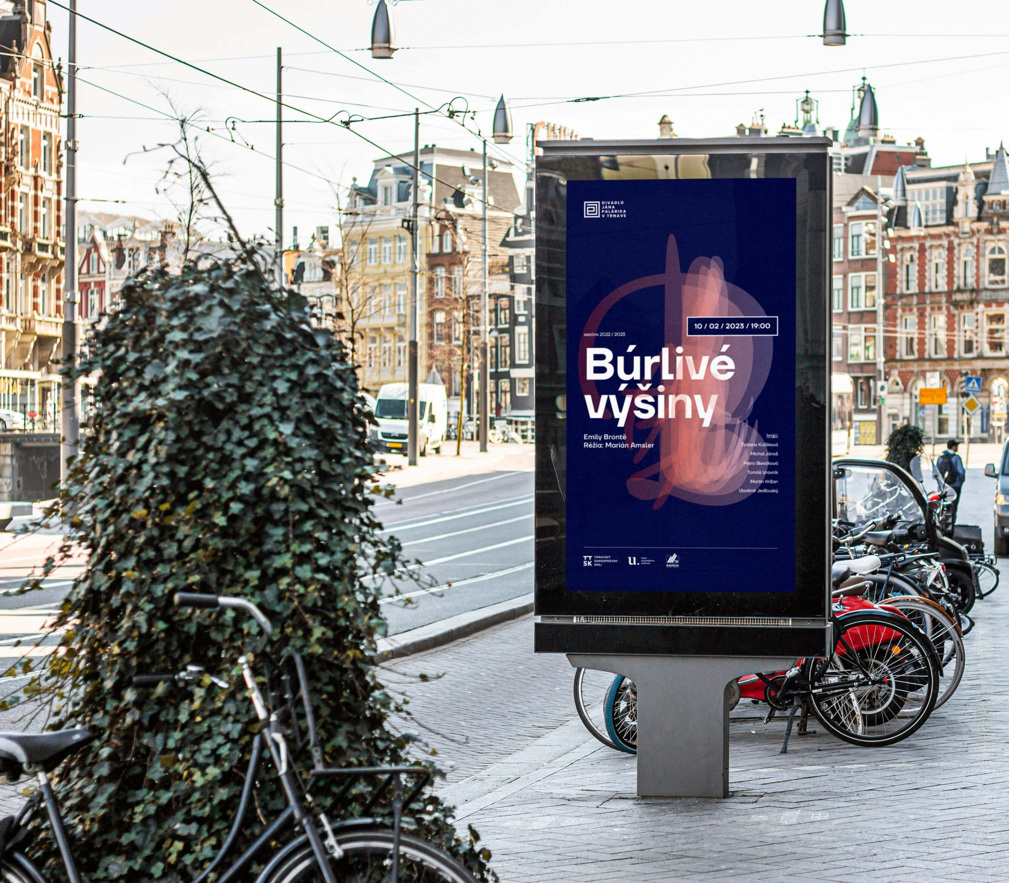
the principle of creating automatic illustrations, which will significantly speed up the design of the poster