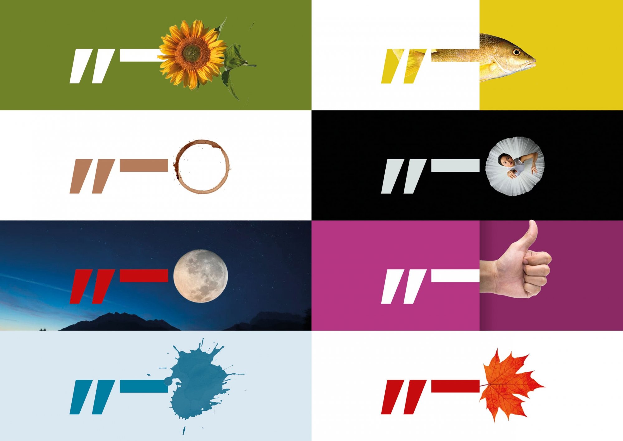
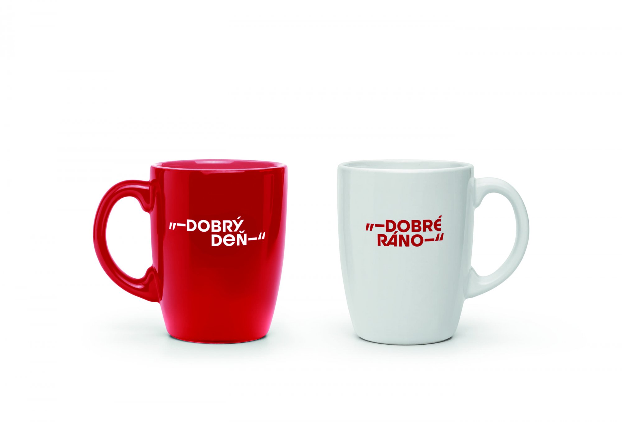
The logotype directly illustrates the scope of BCIC’s activities: from informing (quotes) to organizing cultural events (asterisk). Also, the characters together form a key as a clear symbol opening up new horizons. This concept isn’t basically tied to one particular font, but here I chose a similar visual language with the Bratislava city logo to harmonize well with each other. The selected font with its brave stylization and sharply cut shapes supports the lapidary tone of the brand, but at the same time has some sophistication. In the following visual identity may develop the game with dreamy meanings of various characters.


