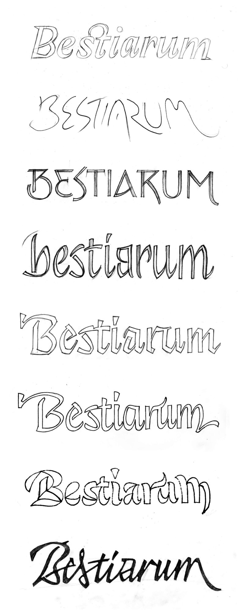
Identity for a one man perfume brand
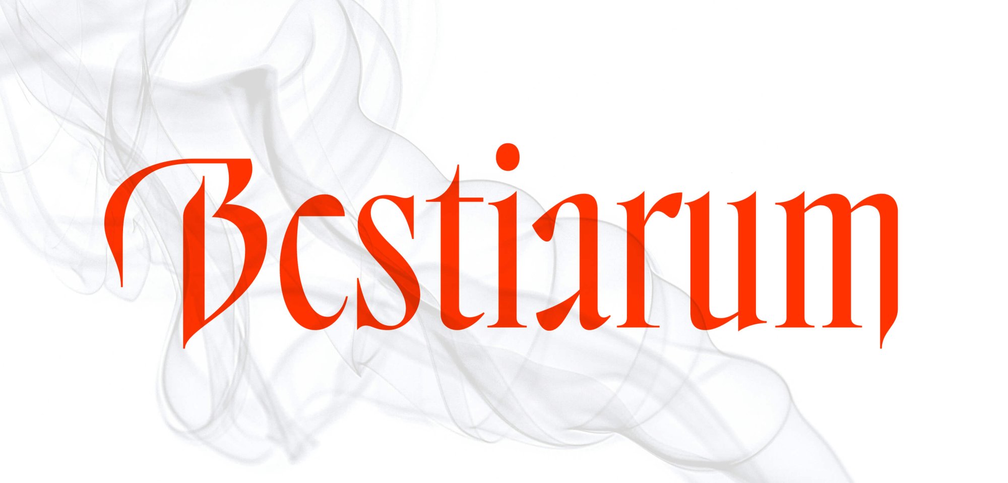
The brief was to create something that is unmissable, mysterious and evocative – essentially the opposite of well-known luxury brands. It had to look premium and confidently. The blinded inner spaces of the letters give the logo an even darker expression and indicate a focus on a other sense than 👁️
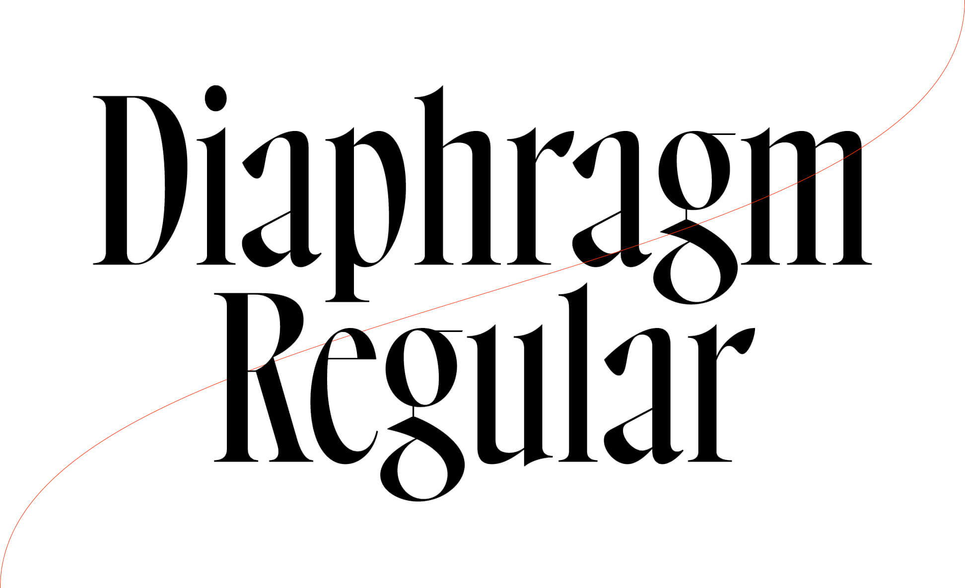
👉 The font Diaphragm by Antonin Bertrand is a great fit for the dramatic voice of the brand. It is complemented by Open Sans Condensed (body text).
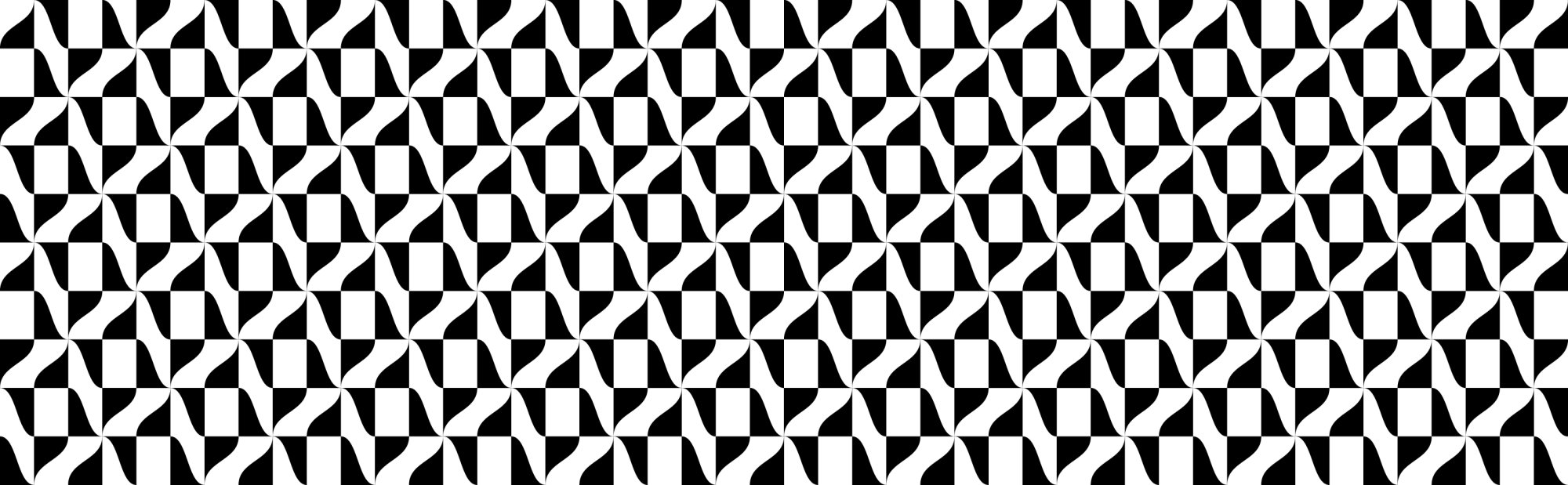
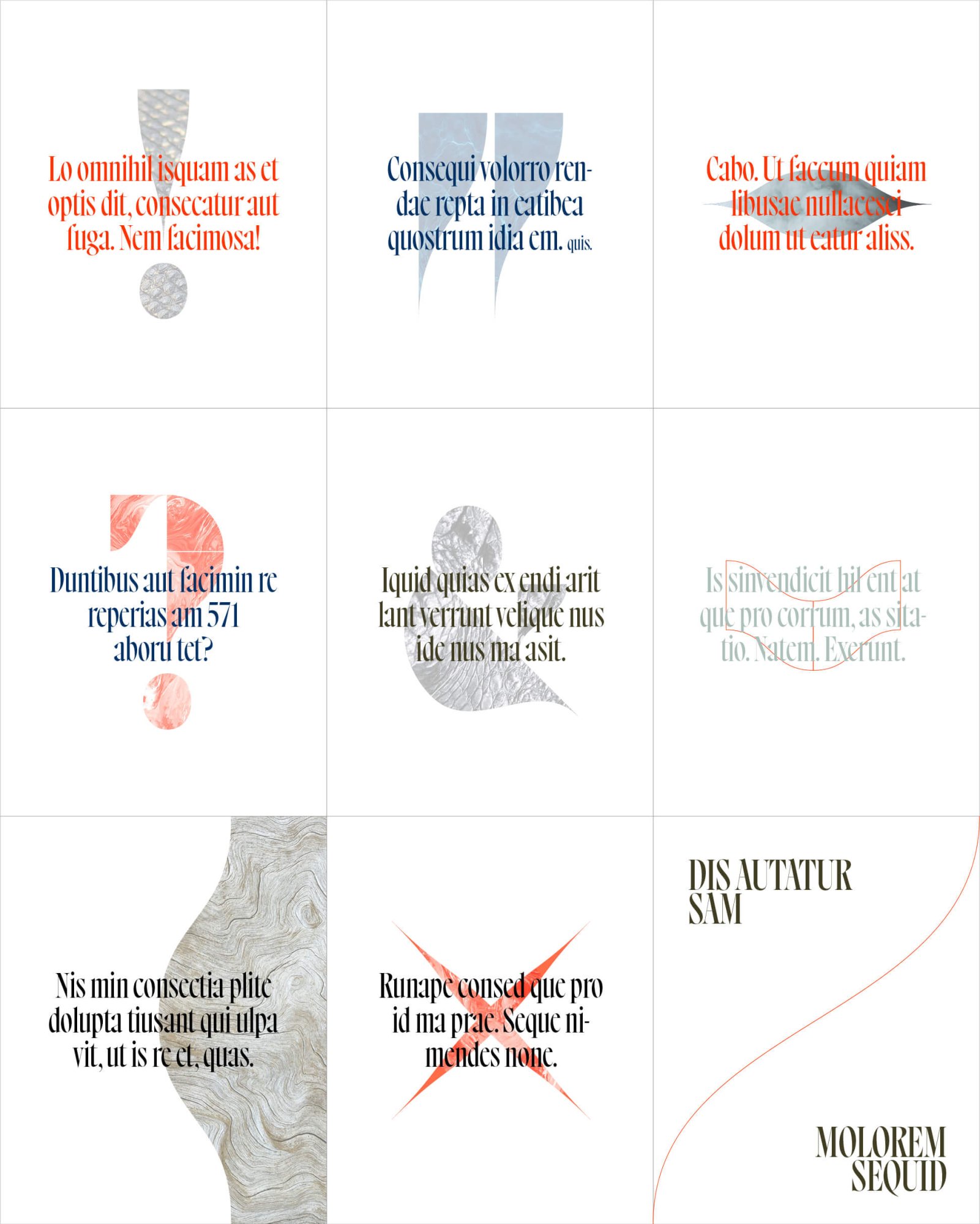
👉 Graphic element – derived from the wavy folds in the font. Waves also naturally suggest the symbolism of scents. It is intended to reinforce the brand code. It does not have clear proportions, it can be expanded and contracted, replicated and rotated as needed. It can carry different meanings in the form of typographic characters, or it can serve as a cutout for an image.
👉 Textures – images of natural materials such as clouds, smoke, leather, etc. used as a background for the text. They are meant to create an atmosphere.
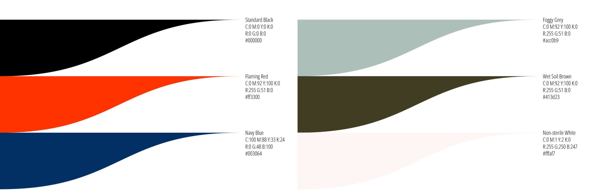
👉 Colors – also inconspicuous, evoking natural elements with one sharp exception – burning red.