How and why is the font created?
The creation of a unique, crafted font is an art. It takes a long time and its creation cannot be conditioned simply – it is not a factory production. It is all the more valuable if the idea for a new typeface sees the light of day.
To create a new font, you need a strong impulse – something like a big bang – a really strong idea about what could be improved or solved differently in this oversaturated world.
Does the world need this font?
The most important question in creation. With classic text fonts, it is difficult to answer positively. Because just as we cannot bypass the laws of physics, we cannot dramatically improve the shapes of letters for better readability, which is the ultimate criterion here. Therefore, these “classic” fonts will inevitably resemble each other. Experimental fonts have a clearer answer to this question – their creation can be “justified” by the fact that it is something original, unwatched and therefore welcome for refreshing the “gene pool”. Their focus is completely different – it is not about moving information into the human mind as smoothly as possible, but about forcing attention.
However, due to their specificity, experimental fonts have only very limited possibilities of use (or they are created only for a specific environment).
What must a “perfect” font contain?
The ideal candidate for a new typeface must have something from both poles, so that it does not end up as an experiment in a drawer or as another classic, sadly gathering by dust. The ideal balance is difficult to solve within a single font style, but today it can be solved very elegantly with the help of variable axes, which do not have to be limited to changing “weight” or “width”. They can change even a completely ordinary, universal font into its wild version. “Infinity” in their interpolation actually covers the entire range of expression – from an inconspicuous gray mouse to an extravagant star.
Variable axes do not have to be only weight and width, but can completely change the expression of the font (the font used is under development).
How long does it take?
There is no rush when designing – this could mean wasted hours of work and after sober reflection, going back to the very beginning. I'm still comparing my idea to existing fonts to see how others have solved a similar problem. The next point is sketching – this should give a definitive answer to the question of whether this font should be created. By sketching, we can quickly compare the consistency of the design – i.e. whether all the characters follow a uniform line, because otherwise it would easily spoil the whole impression (you can, for example, have a character originally drawn, but if this novelty does not have an echo in other letters, the text will look chaotic). I think that this kind of matching is the essence of typedesign.
So it is understandable that something like this does not take hours, but weeks and months – it is a piece of art that must be left to mature and will bear fruit only when the font is used correctly.
Sketches look promising – what next?
In an ideal world, the best sketches should be digitized, that is, redrawn into vector curves in a font program. In reality, it is not necessary, because many parts of the letters can be “recycled”, thus saving time. Of course, it depends on the nature of the font. The more uniform it is, the more its shapes are repeated and can be automated. On the contrary – if the font is based on imitating the writing of a human hand (script, calligraphy), here it is welcome that no character looks the same. It cannot be said that one or the other path is more valuable, because each one solves something different, and just as we would be disturbed by the irregularity of characters in plain text, we will be disturbed in live text if we notice the same inaccuracies on a repeating character.
Designing the character itself is the most satisfying part of the job – because here we see the immediate result, we see how the characters look in words and entire texts. Again, it is advisable to look at them as a whole, so that we don't miss the overall proportions because of a few beautiful details. Fine-tuning the details is really at the end of this creative stage.
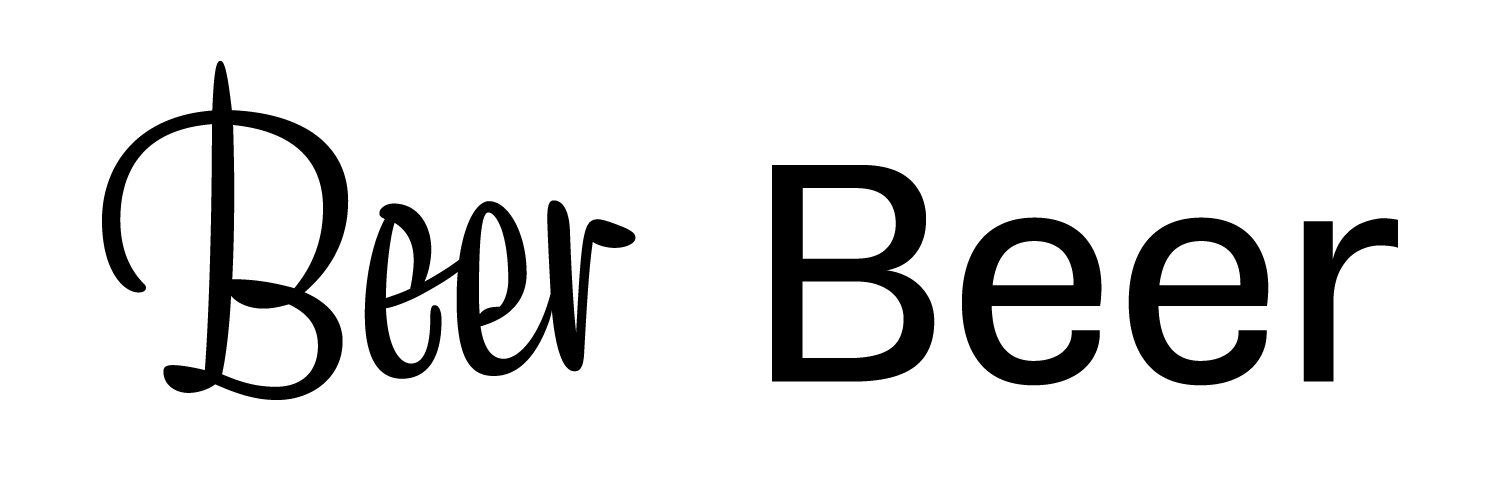
Sample of proper script font (Liza Pro) and universal clear font (Cosan Cold). Liza automatically varies her characters so that there are no two exactly the same shapes next to each other – this would spoil the random impression of handwritten text. Cosan, on the other hand, has set fixed and unchanging shapes – there any change would look out of place.
Will it be already?
The last big stage is tuning the intercharacter spaces. Setting the spacing doesn't seem like much of a challenge, but the truth is that it's the most time-consuming and boring part of the job that deters many people from completing their fonts. Correct spacing is just as important for the font as the shape of the characters themselves. In other words, even perfectly crafted and polished characters will look silly in text if they don't have the same rhythm. They are set on two levels – the first is spacing, where we determine how far the previous and next character will be located. There are no exact formulas for this, it has to be done by eye. However, there are problematic pairs of characters where it is not possible to maintain the same rhythm in the word. These are asymmetric signs such as “L” and “T” that may look almost like they are separated by a space. That's why the word kerning comes into being – manual alignment of characters. In short, the point is to fix as many such naughty combinations as possible. A really well-tuned font can contain over 1000 of them (we also count characters with diacritics, numbers, combinations of upper and lower case letters, etc.).

Example of a hand-tuned space in the combination of the letters “LT” (Cosan Warm font). Without it, the word looks messy, making it difficult for the reader to perceive the text.
Something else?
We still need to program the OpenType features to make the font usable in the 21st century. It's about making it easy to switch in graphics programs, e.g. small capitals, or change the default numbers to table numbers, etc. In order for it to work, we need to have a default character drawn and the character it will be replaced with. Programming itself is not a science, you just need to know the correct ending for individual functions when naming characters. A modern font program generates all standard OT functions by itself. For example in the case of the character “a”, the capital form should have the name “a.sc” (abbreviation for small caps). Possible neoplasms and special forms of signs are grouped into so-called stylistic sets.
After all this, the font can be considered finished (although naming and final preparation will also take some time, but that's another topic).