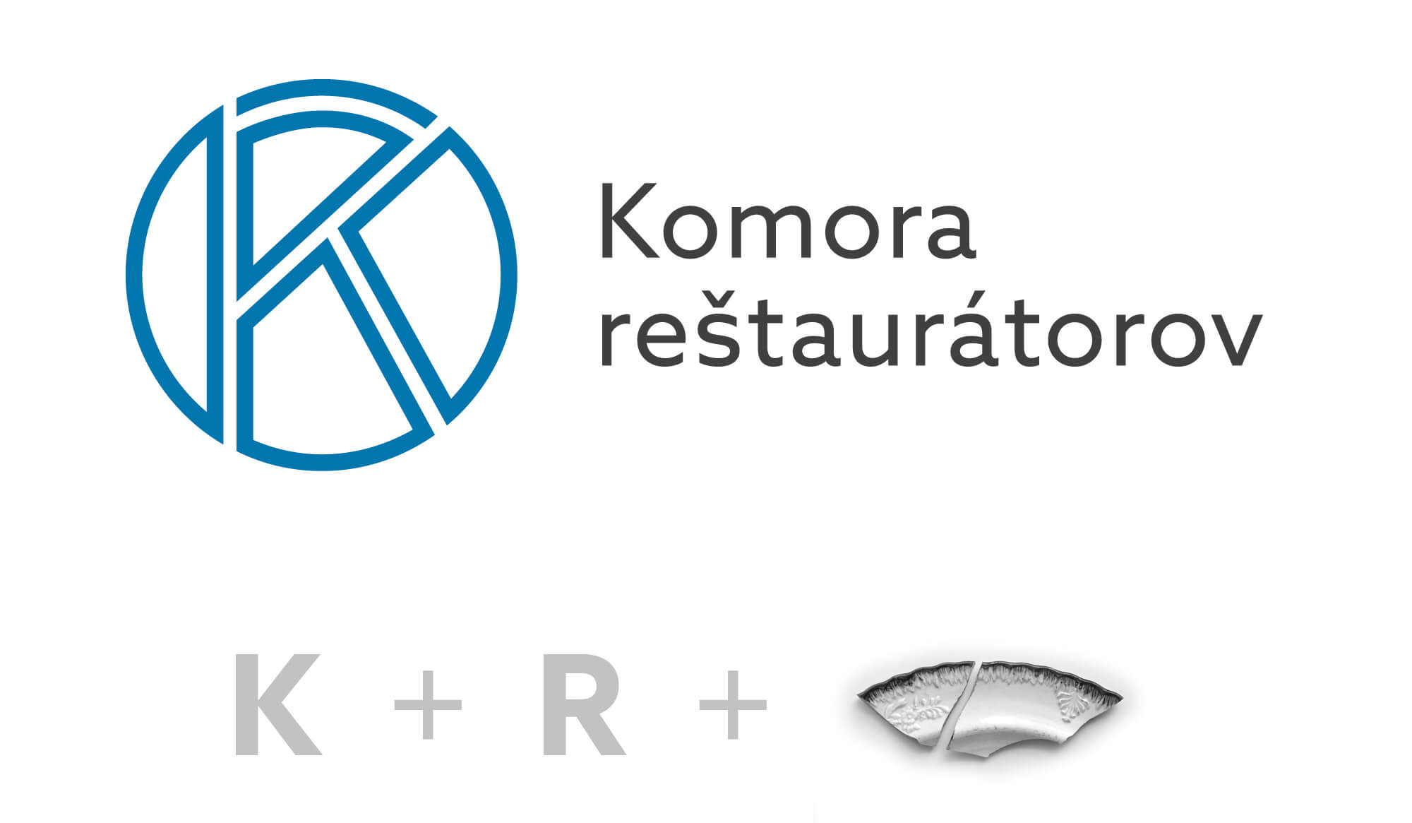
The logo is based on the original concept designed in 1993. The blue color has been given a warmer shade – it has a certain patina effect. The logo is graphically cleaned, adapted to current needs and at the same time aesthetically timeless. The letters K and R are connected, as the initials of the name of the institution, and it also represents a broken historical artifact put back together. Next to the right is a comparison of the old and new logo.